
The prompt for this money project was to design money that didn’t exist. My money’s theme is Vietnamese money if France still had control of Vietnam. I chose Vietnam because it is my homeland, and I’ve always held a deep love and respect for the country, the people, and the culture. This project does not reflect nor state any personal political views.
I sought to highlight staple aspects of Vietnam that France introduced, specifically the cuisine. The first bill is inspired by Vietnamese coffee and focuses on France’s contribution towards Vietnam’s fruitful coffee industry. The second bill is inspired by Vietnam’s signature dish: Phở and focuses on France’s influence on beef dishes in Vietnam. Both bills have a side that features the most important part of Vietnam. A country and its culture are its people, and I wanted to showcase and uplift the hardworking women who make the backbone of the country.
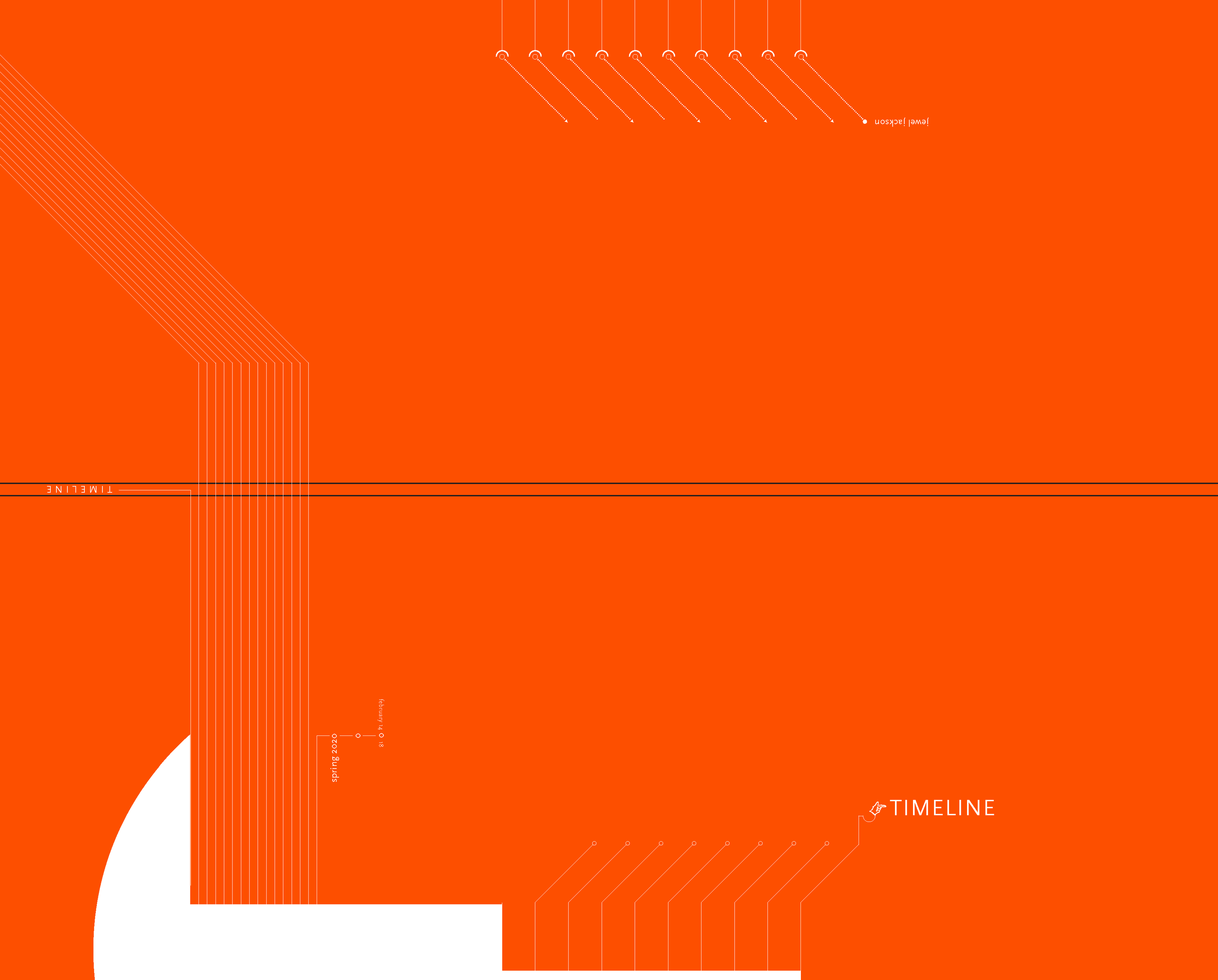
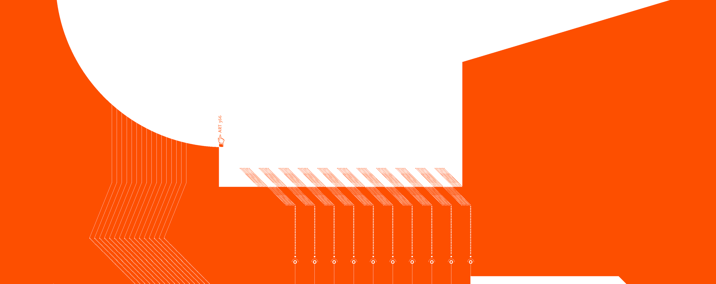

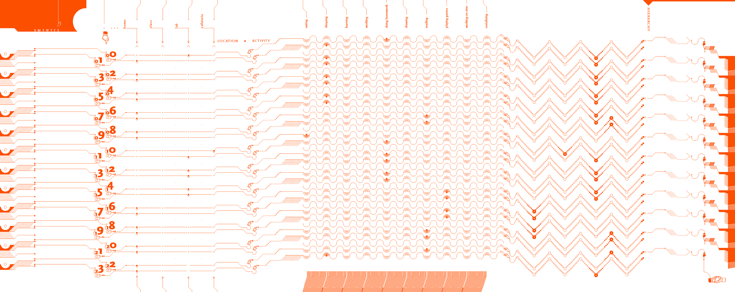
The timeline is a typography project that creates and utilizes a system to communicate a week’s activities. The first image is the cover. The second image is the inside cover which leads into the first day. The day is broken into hour, location, activity, and activity hierarchy.
My timeline’s bright color, bold and unique typeface, and theme express my personality while still retaining the structure and a subtle elegance. This project displays my attention to detail, and countless hours were spent painstakingly arranging each individual object in Adobe InDesign to ensure precision and delicacy.
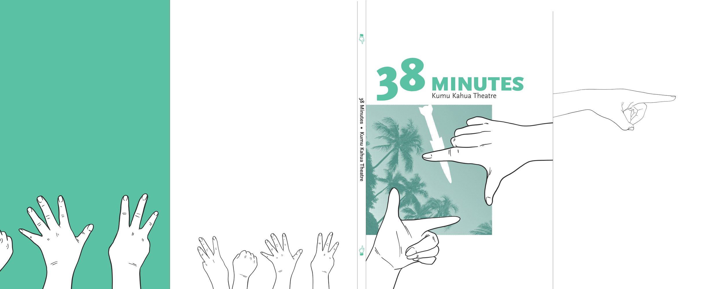
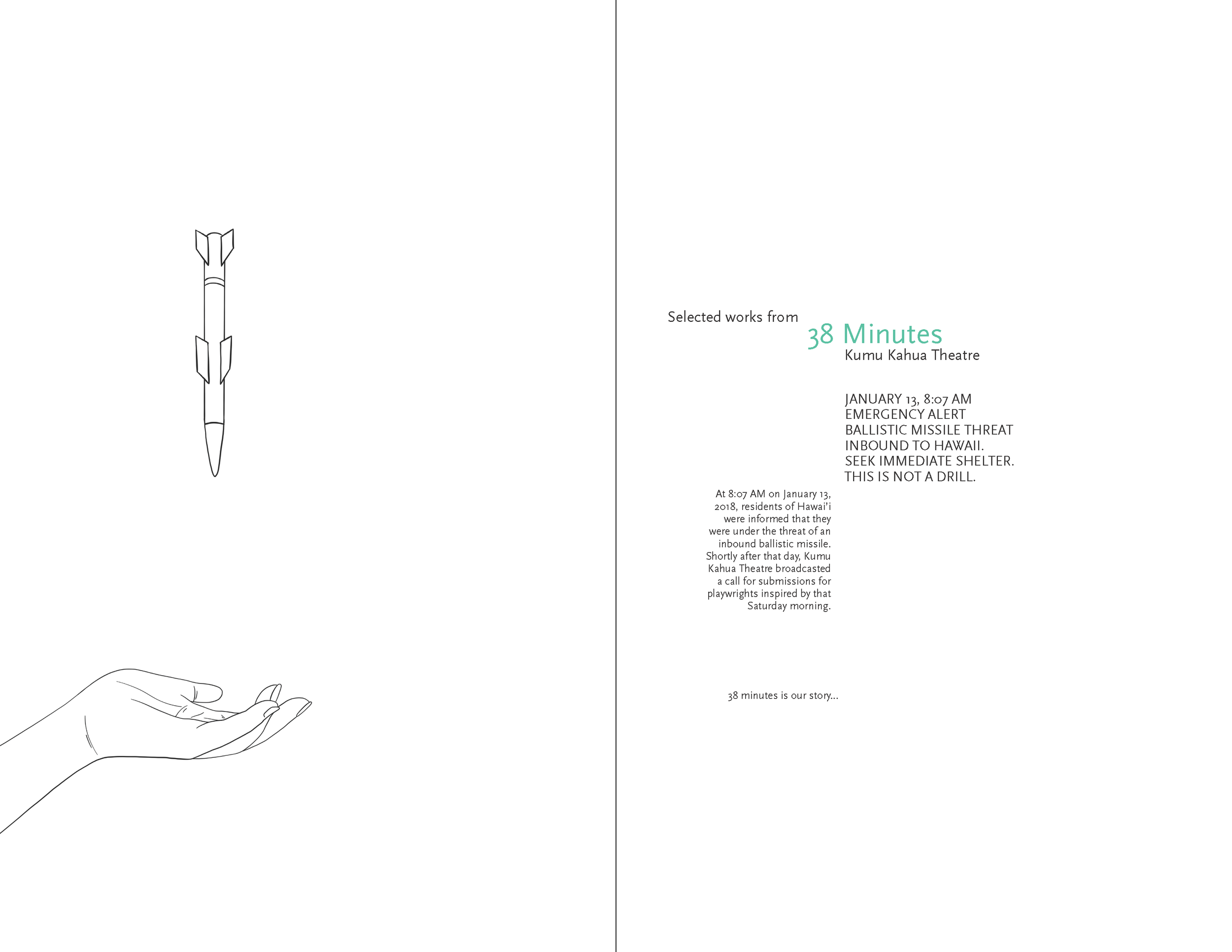
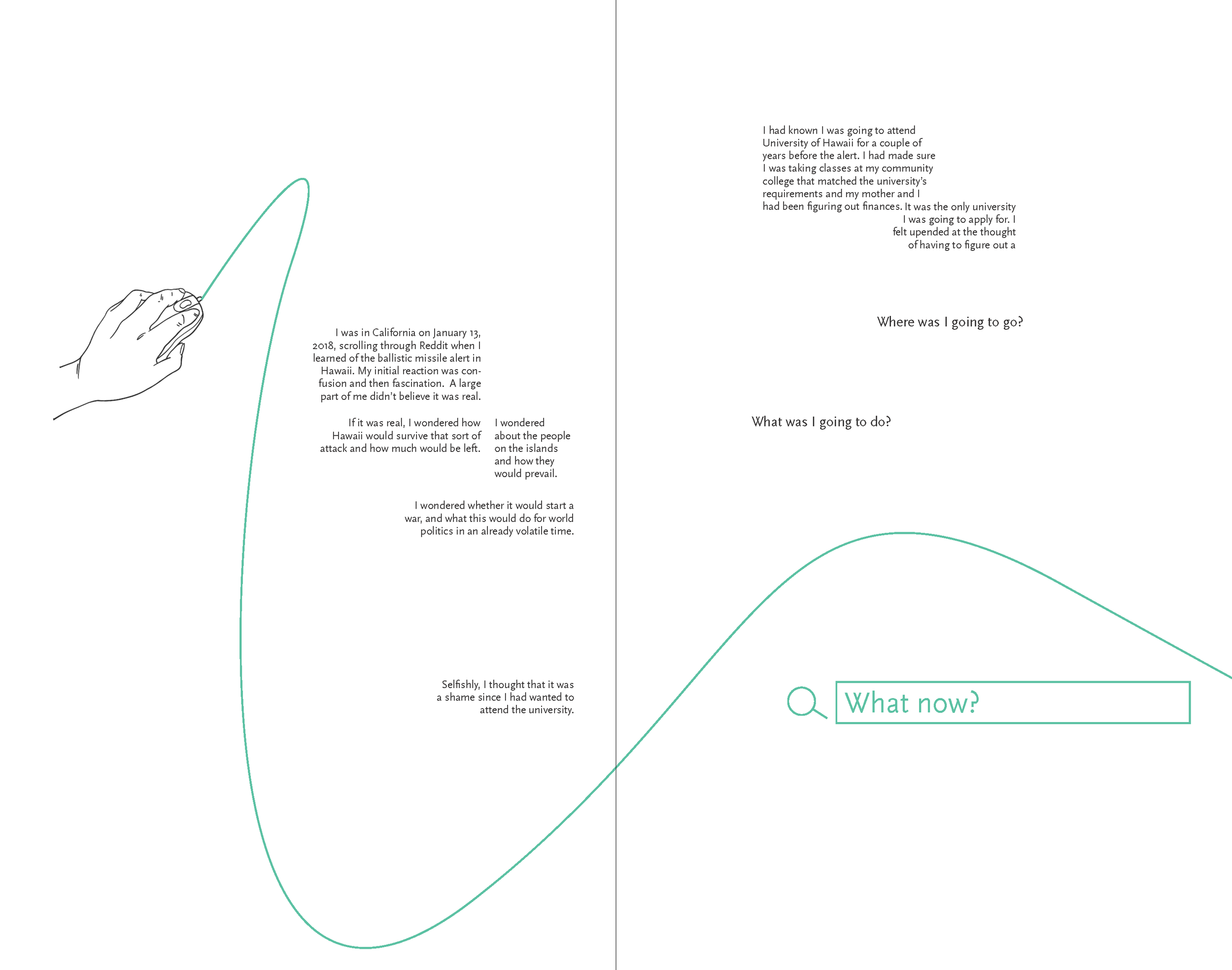

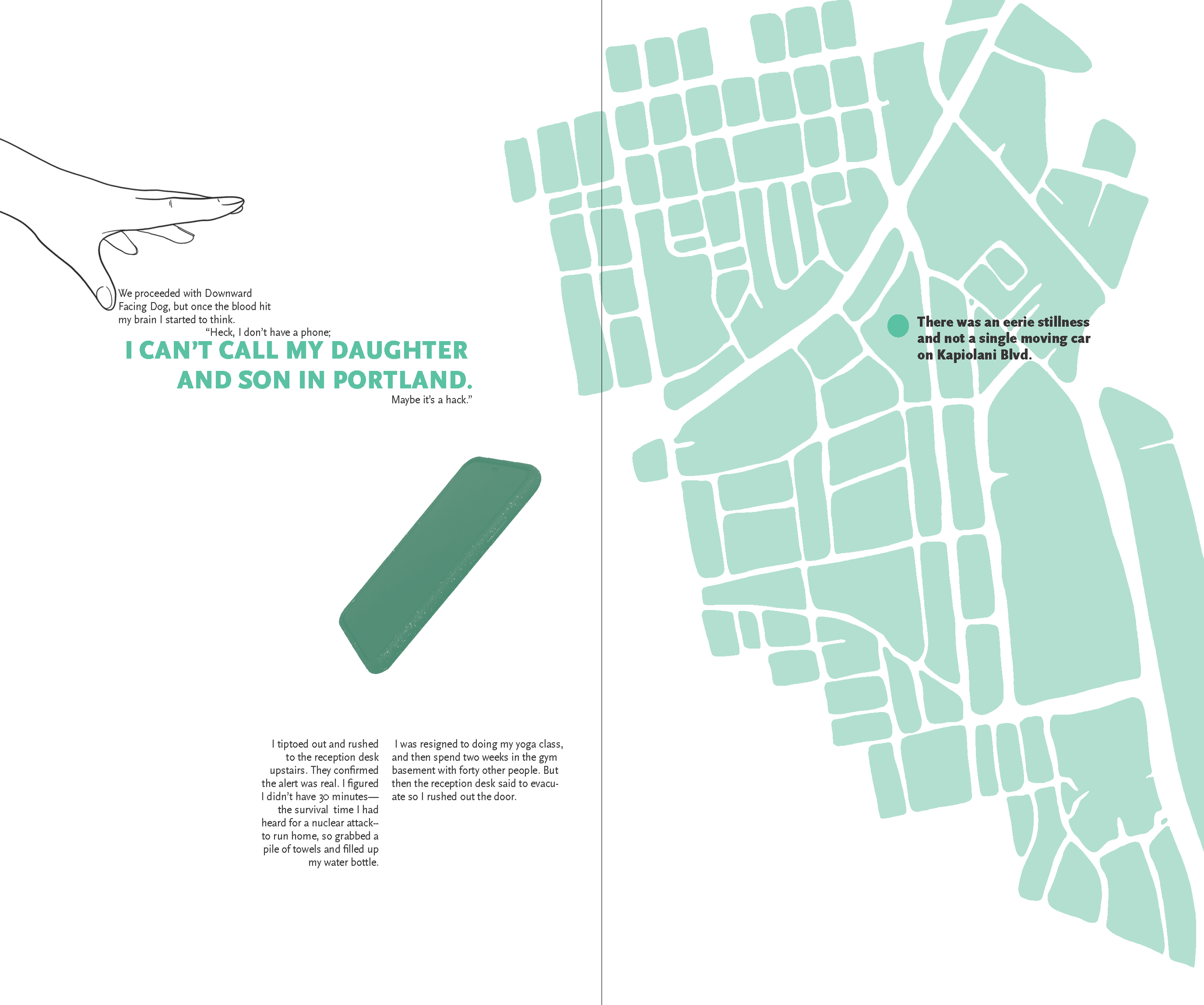

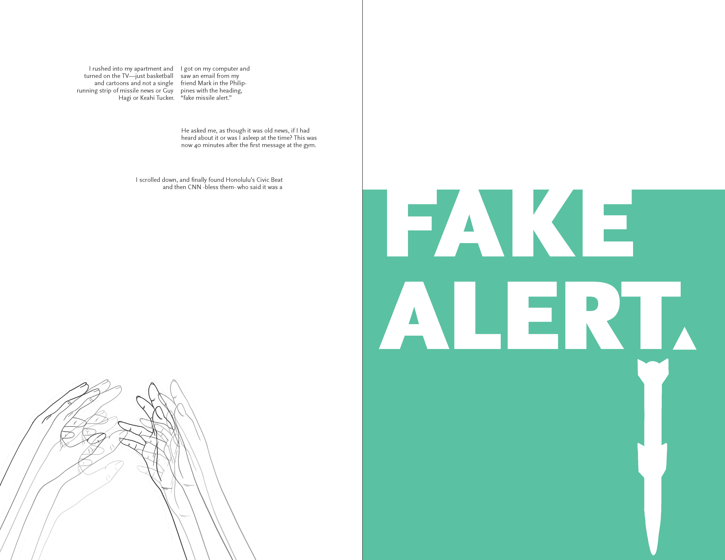
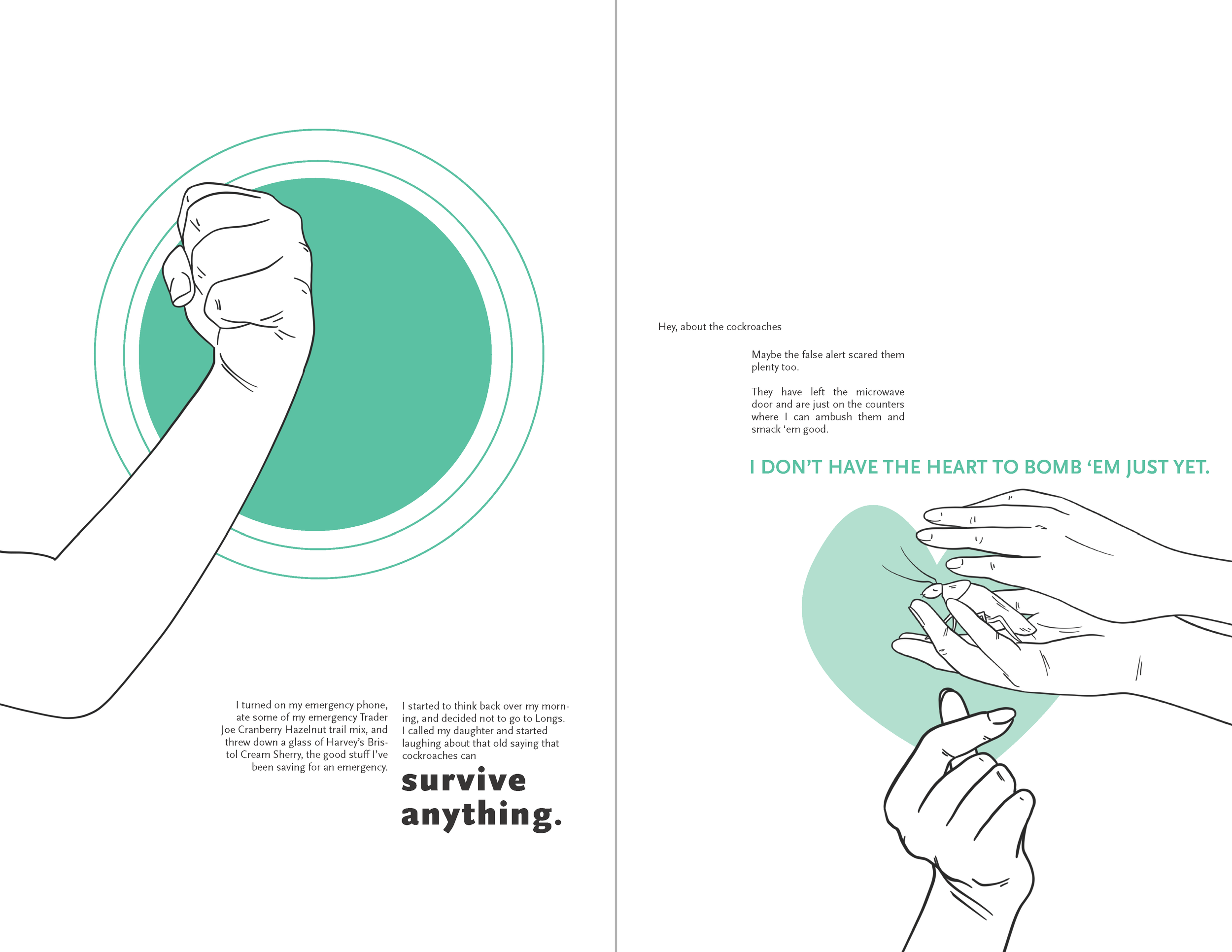
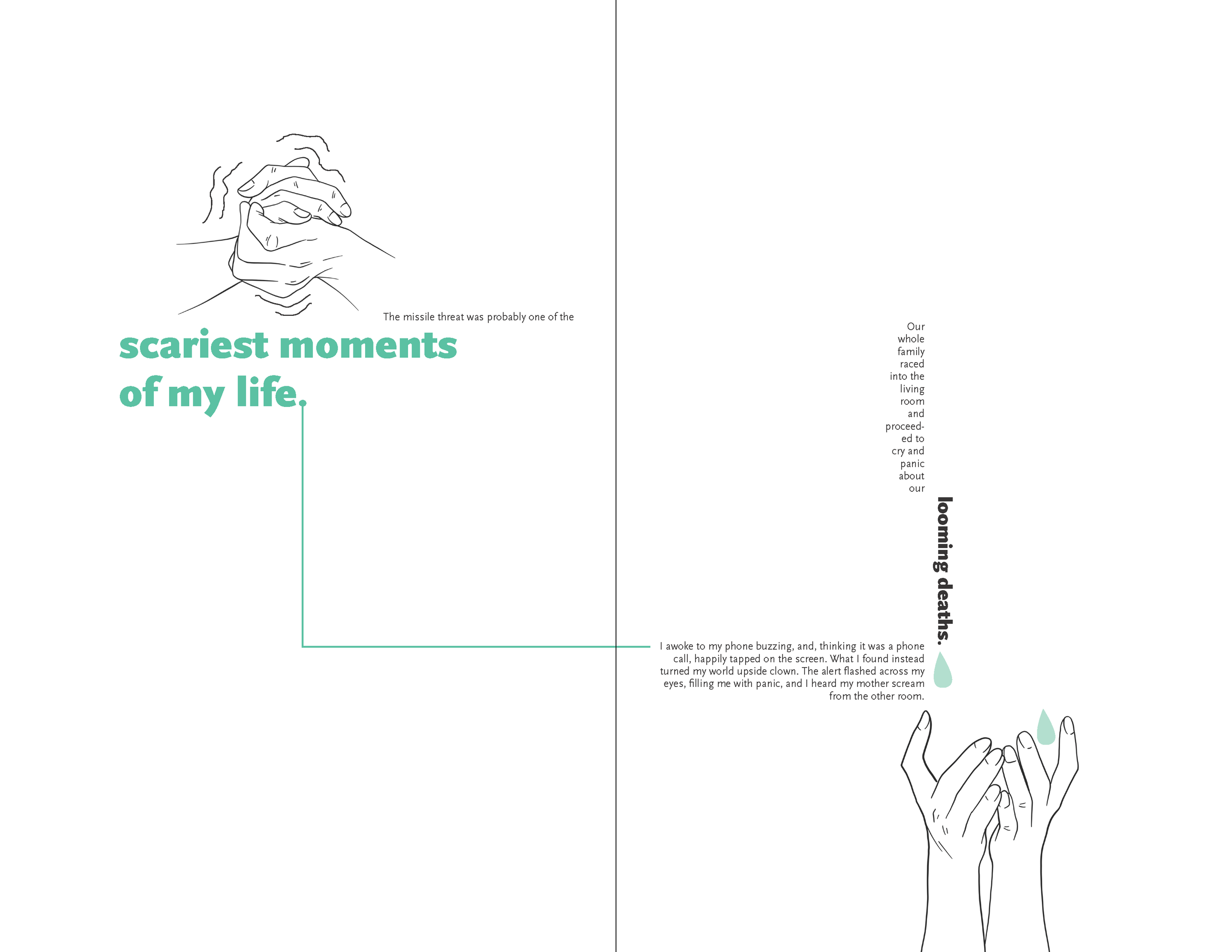
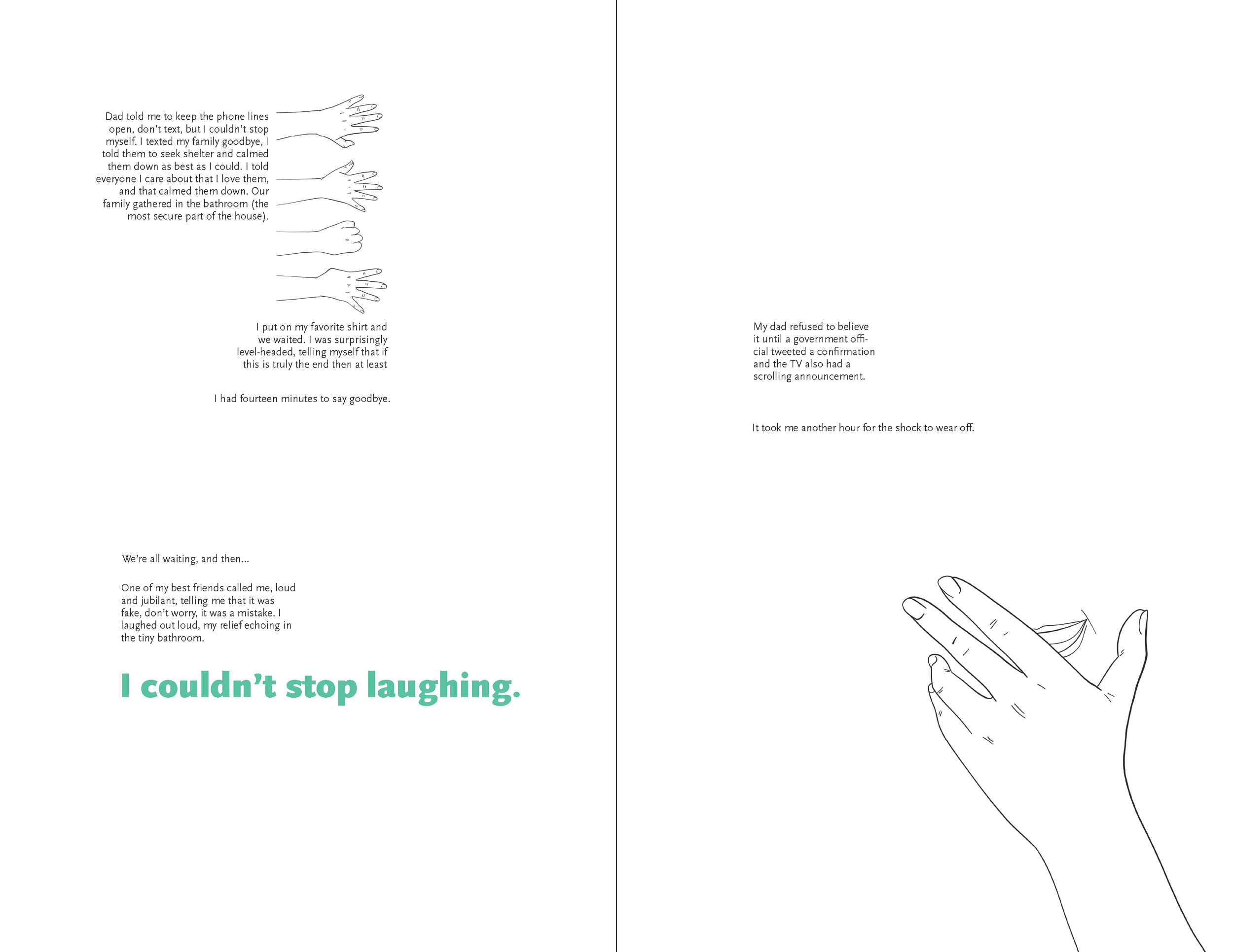
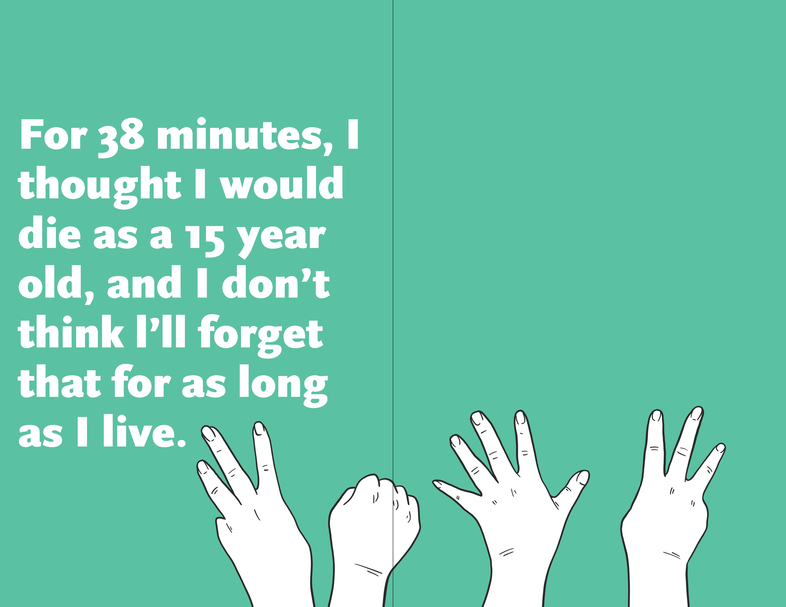
This is a book design project where I integrated illustrations of hands with typography to create a unique and appealing, yet minimalist aesthetic. This is a collection of submitted stories from different perspectives of the day of the false missile alert in Hawai’i. The first image is the cover jacket, the second is the cover, and the following images are the pages.
My goal was to deliver the stories in a way that was both interesting and legible. I aimed for pages that were simple, yet dynamic. The illustrations, which are predominantly hands, serve to provide a visual link to the speakers and lend emotional weight to the words.
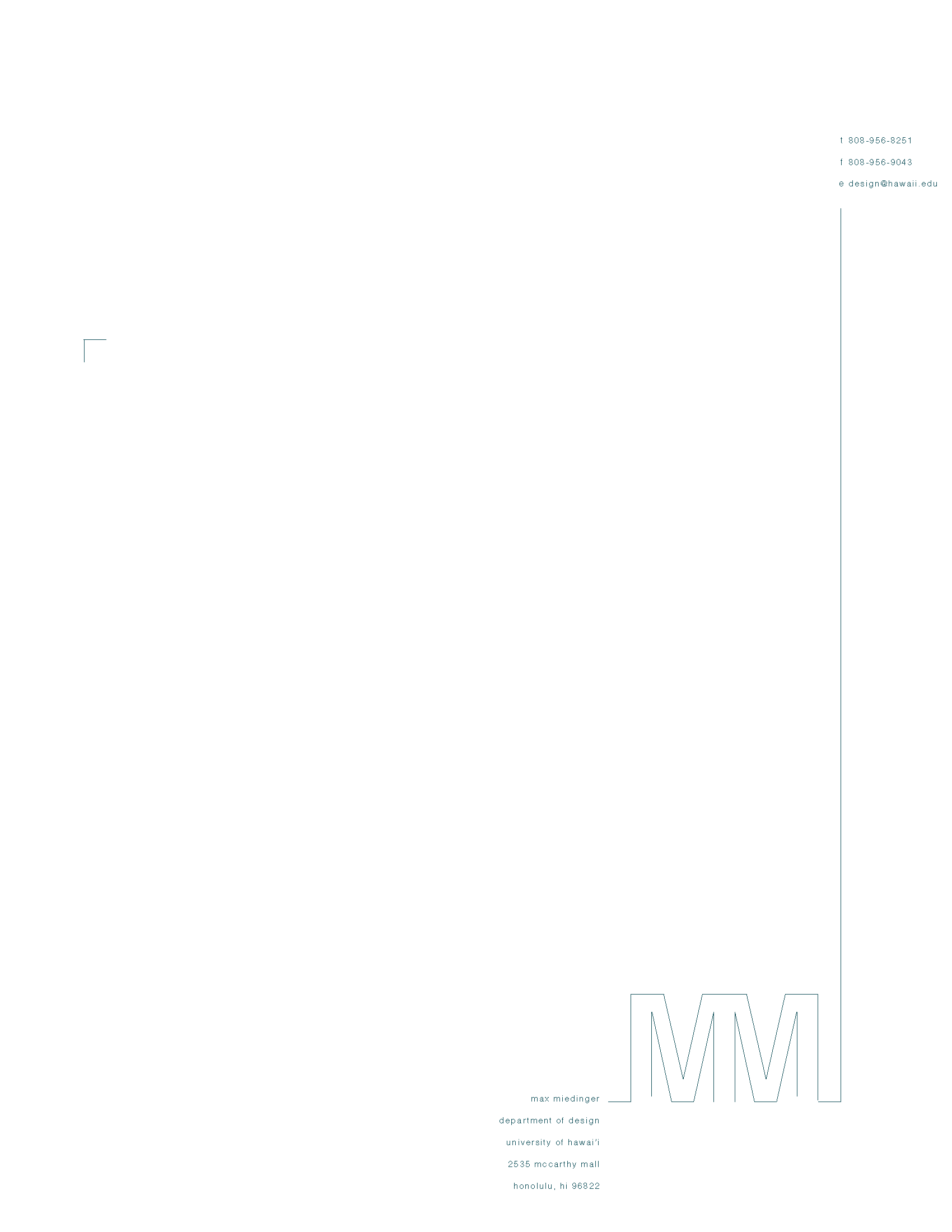
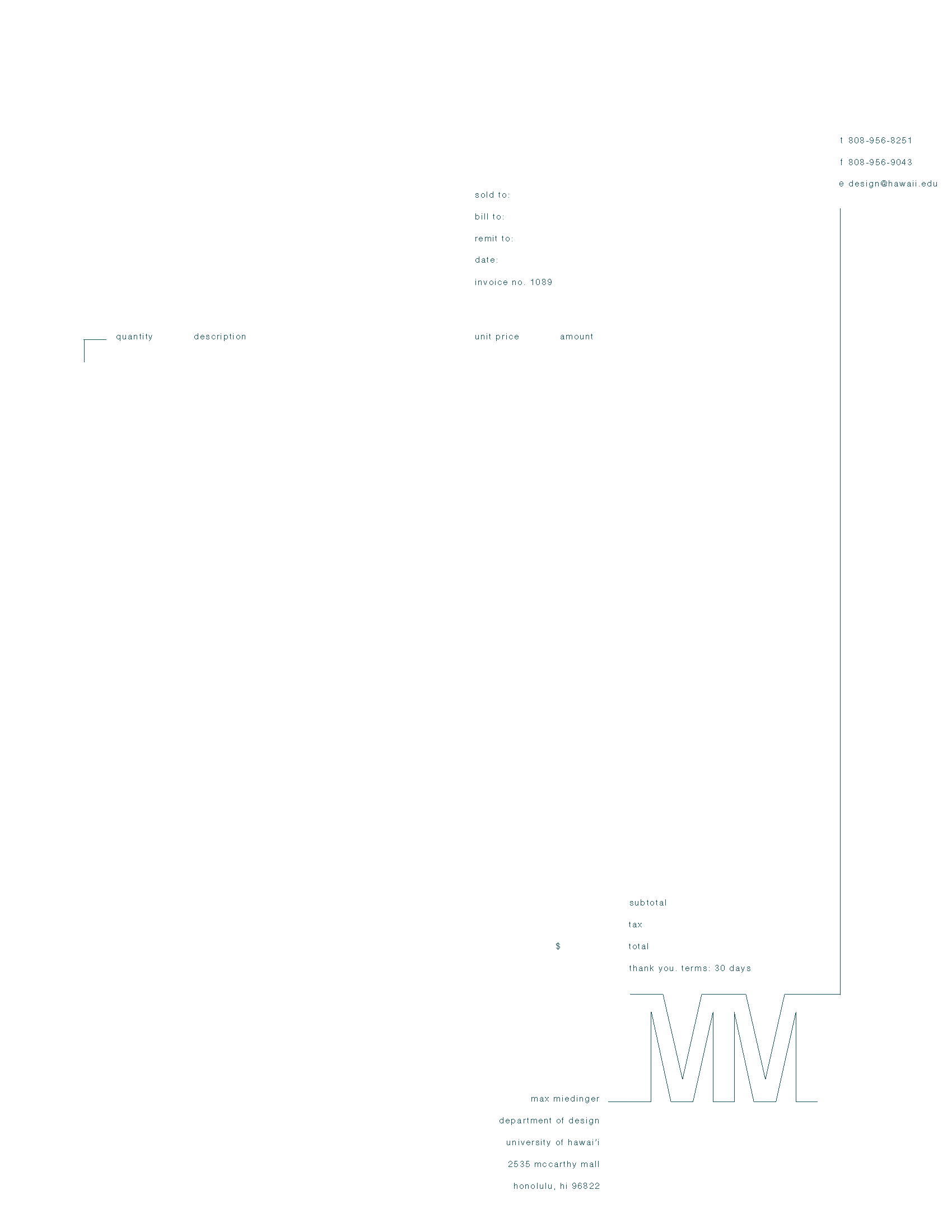
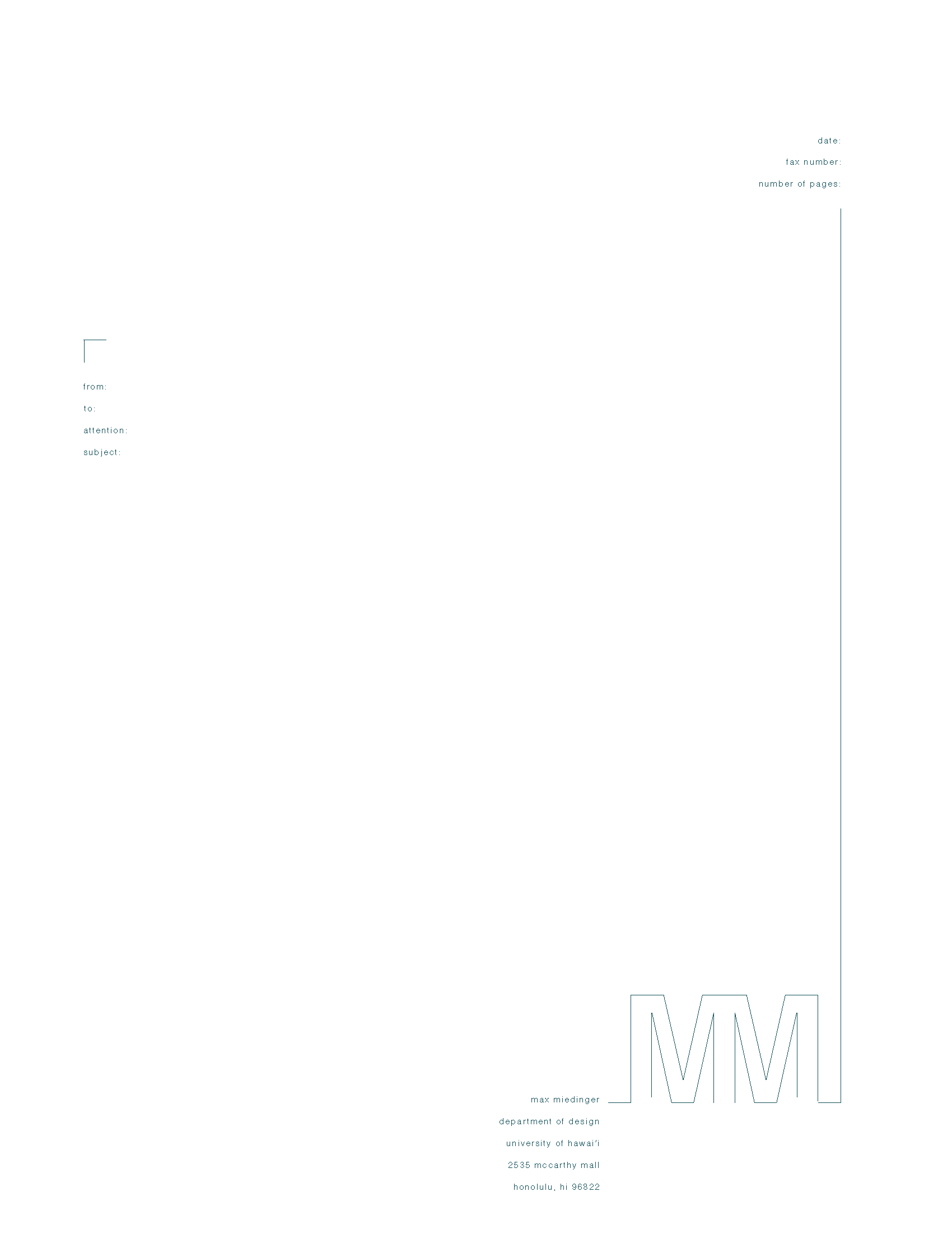
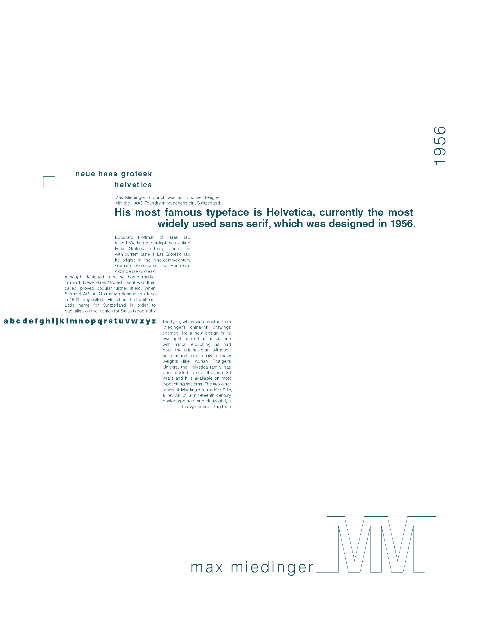
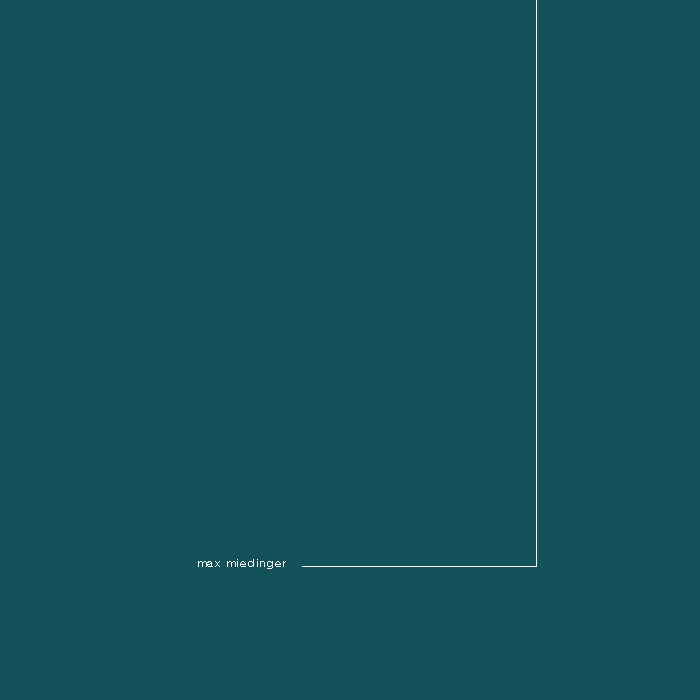
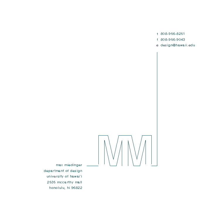

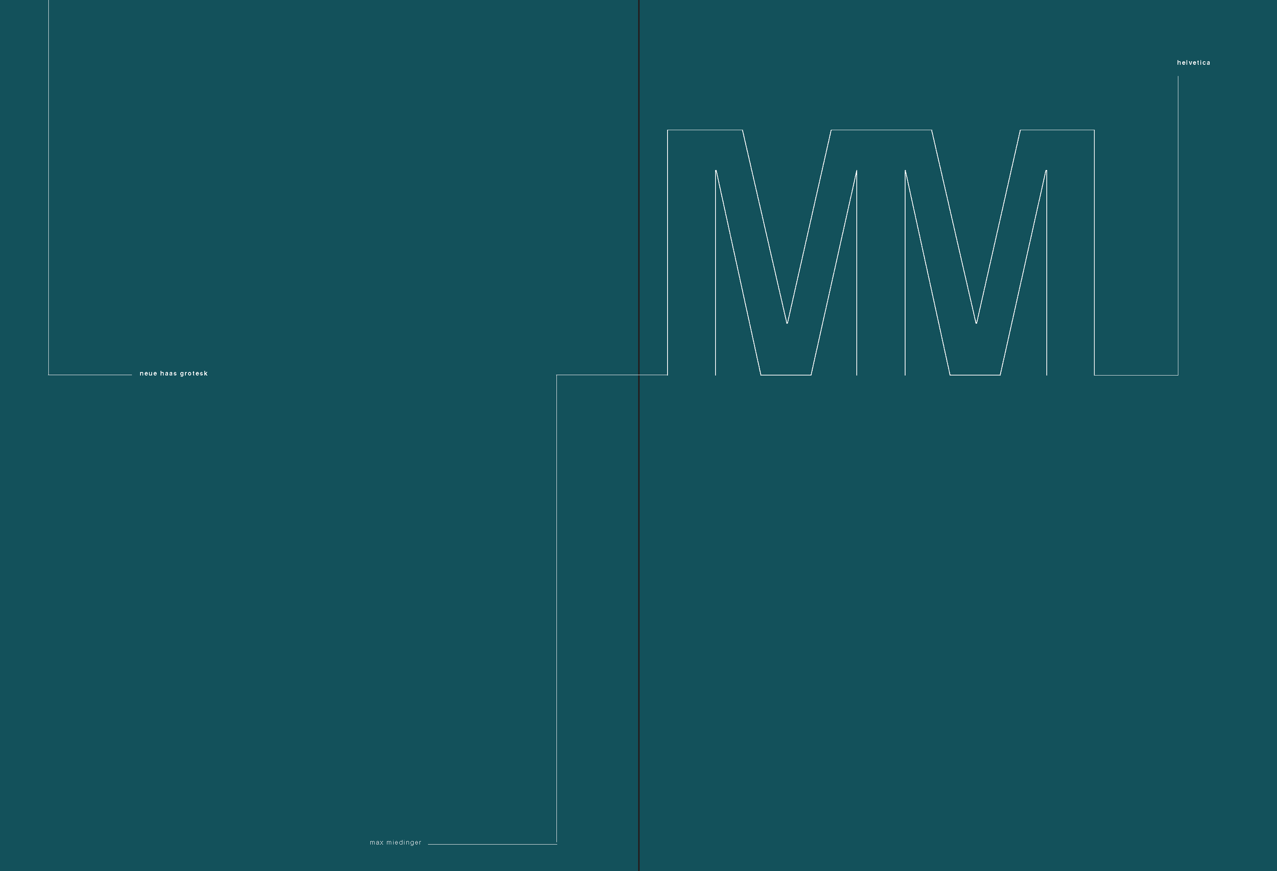
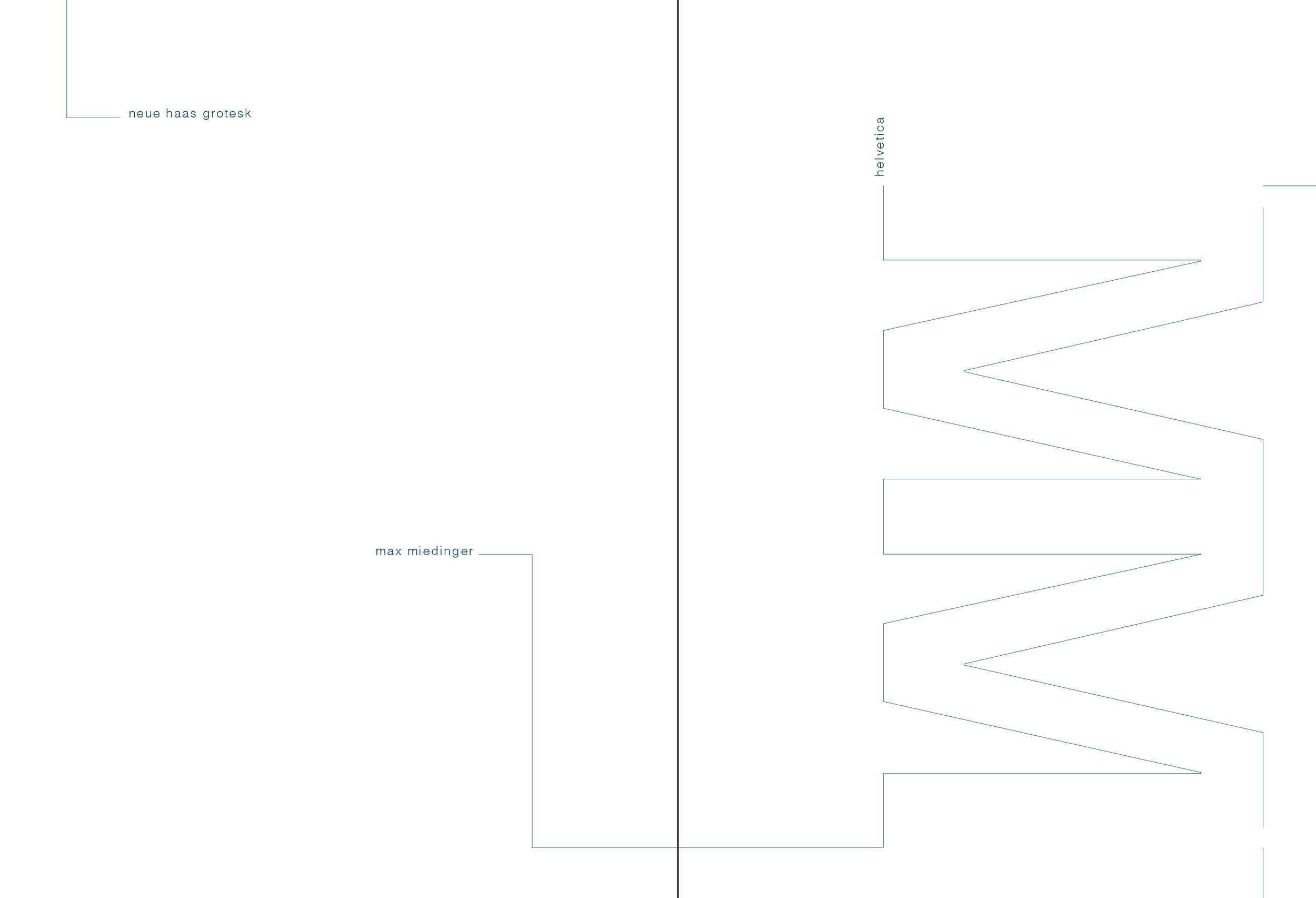
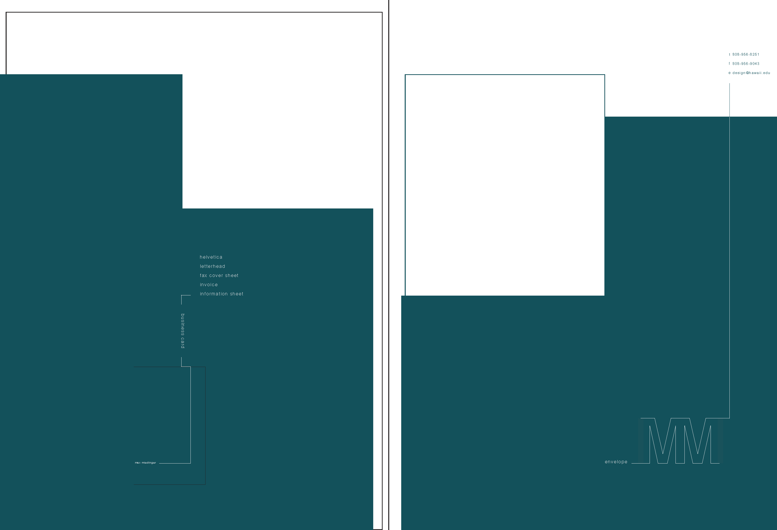
This typography project is an imagined system based off of Max Miedinger’s famous typeface, Helvetica. The entire system includes a fax cover sheet, invoice, letterhead, information sheet, business card, envelope, and folder designs. I aimed to create something that reflected the typeface’s qualities of simplicity, efficiency, and elegance. I especially wanted to highlight the beauty of the lines present in the typeface, which came from Miedinger’s china-ink drawings.


